Rebranding: When the Brand Became Product Experience
Overview
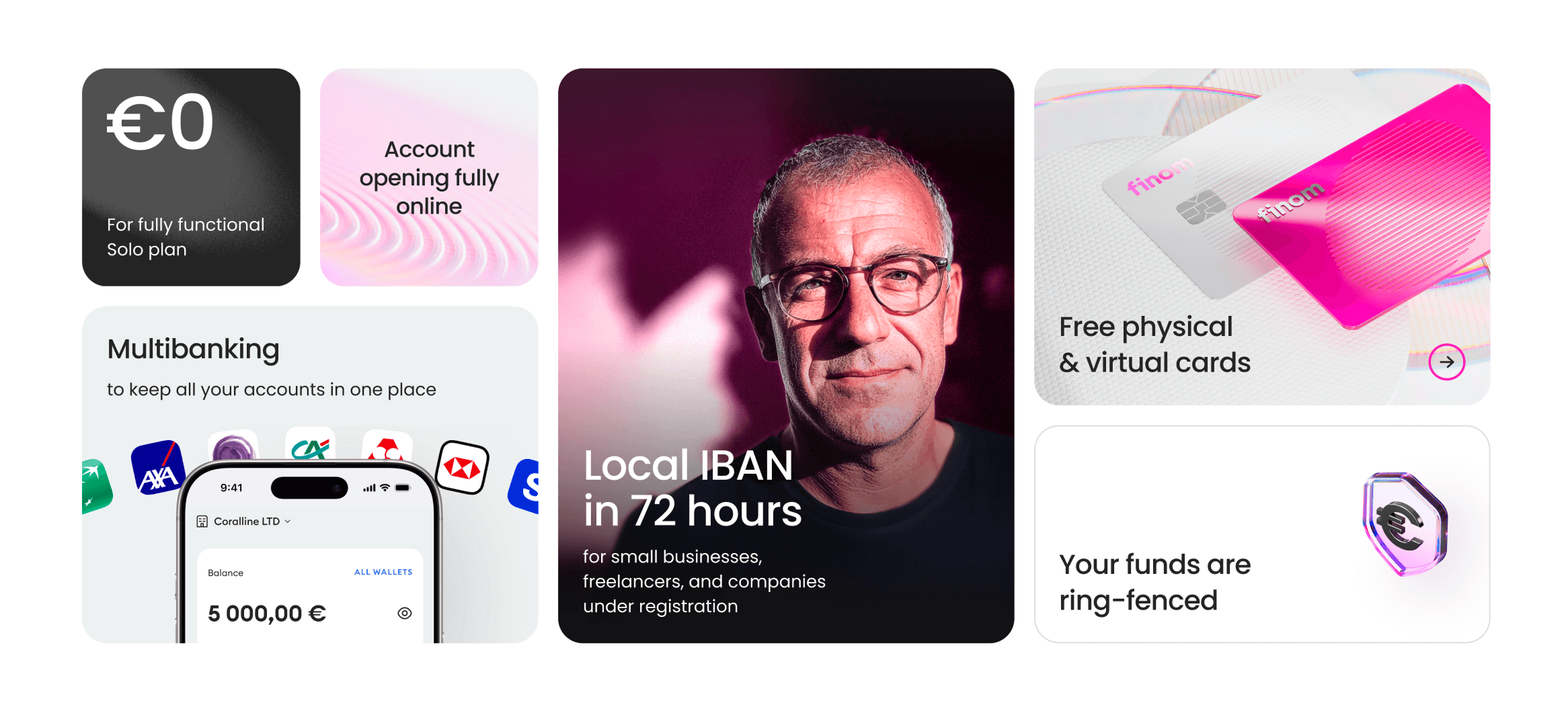
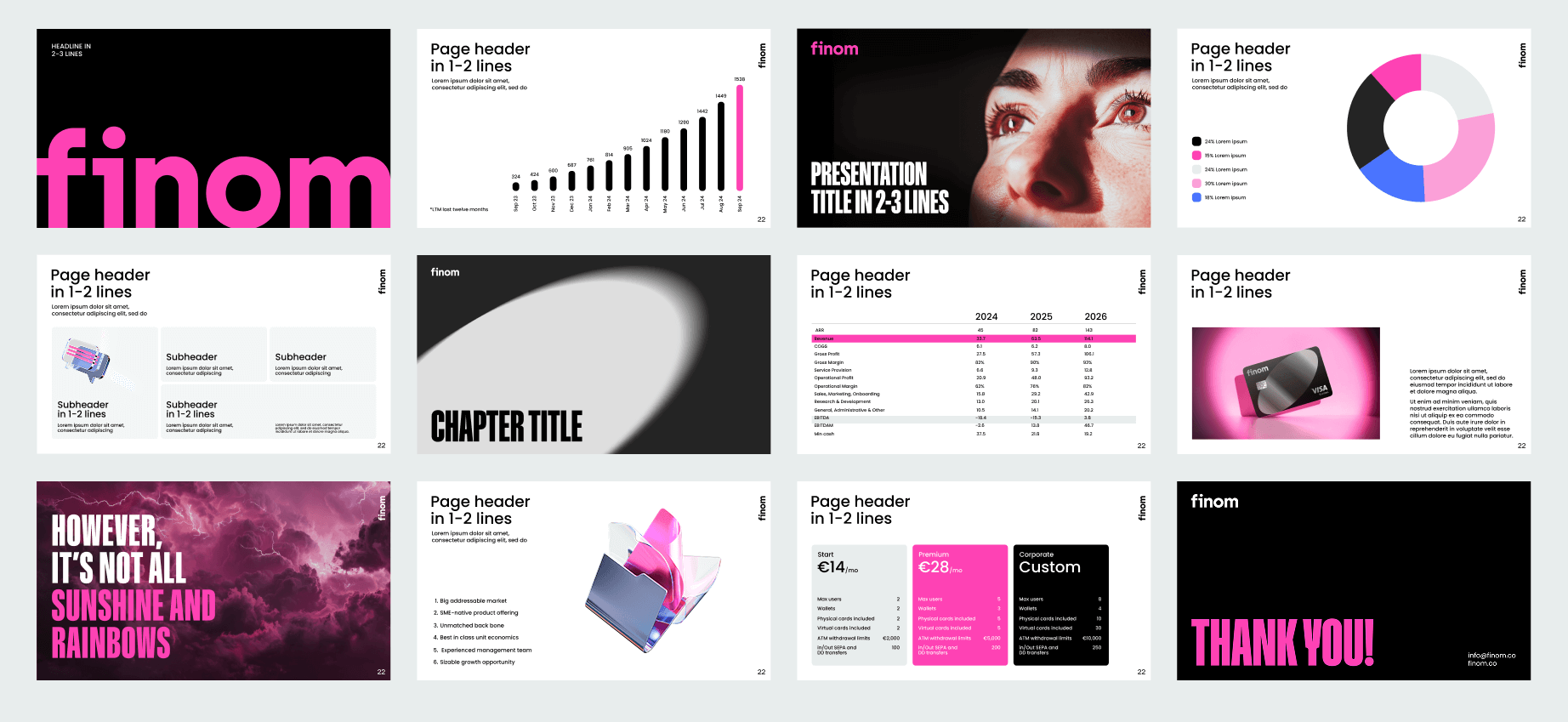
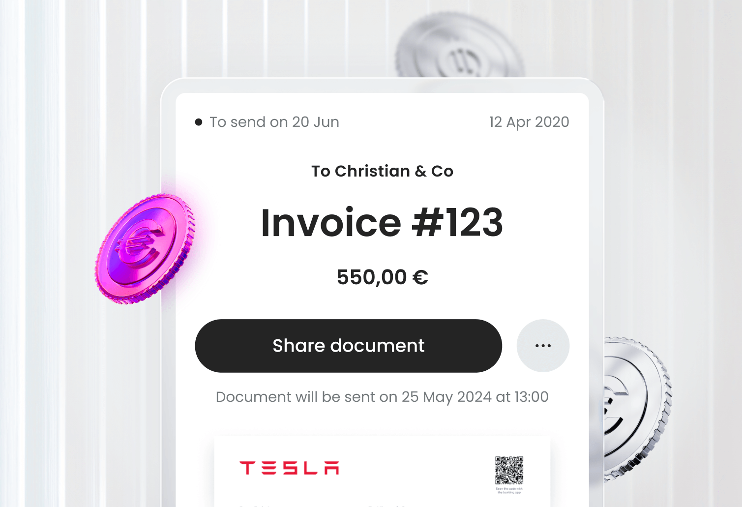
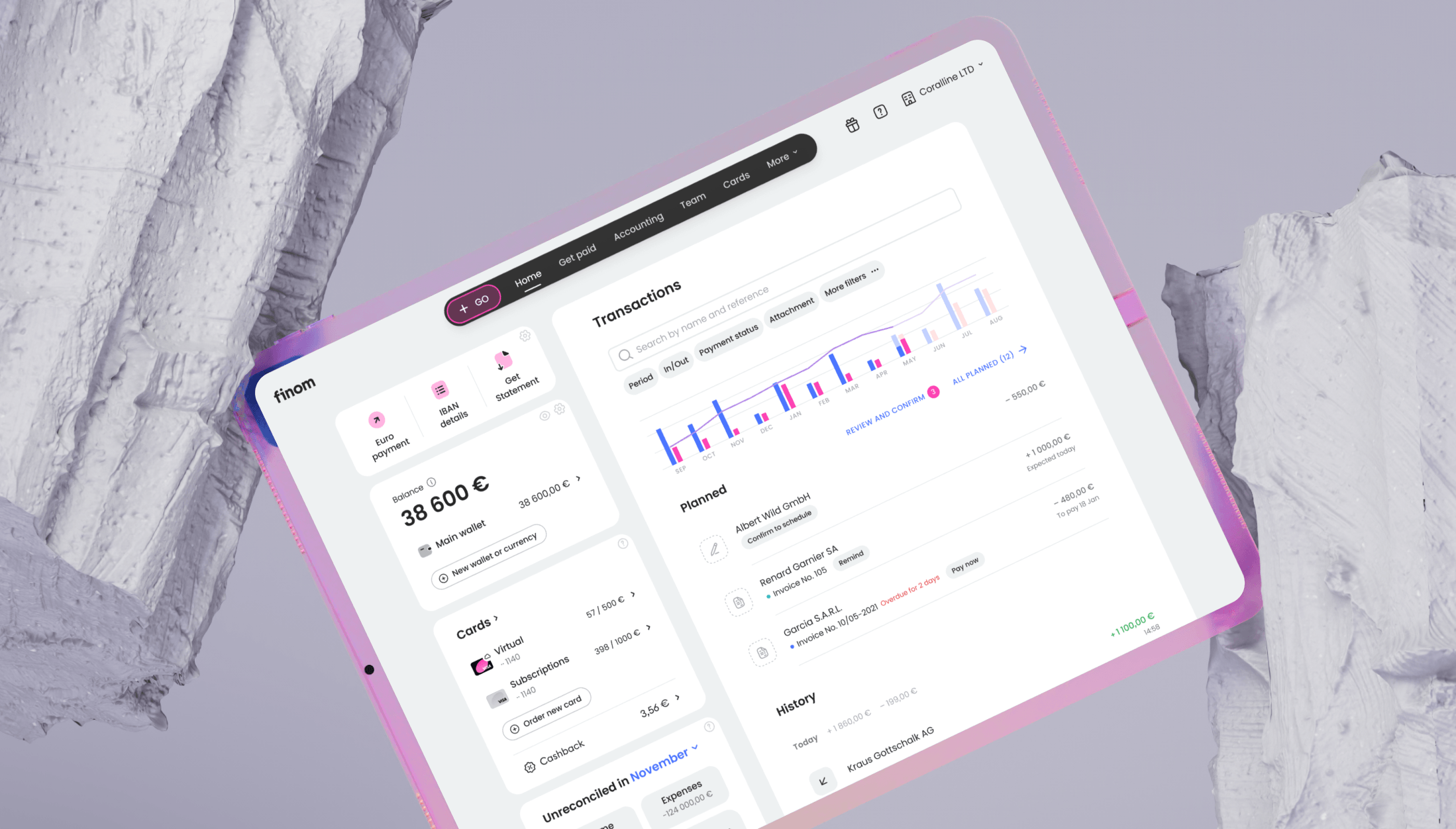
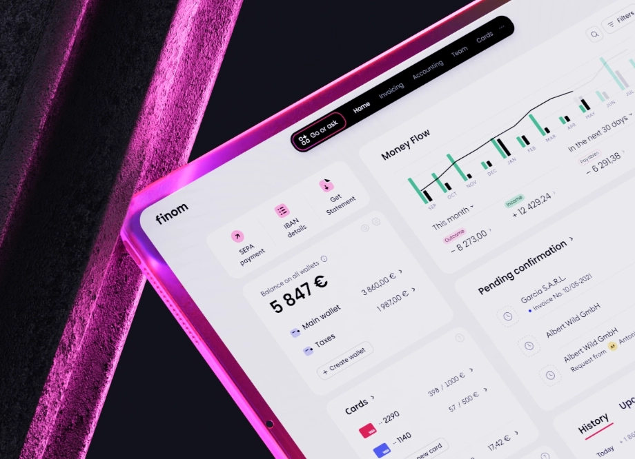
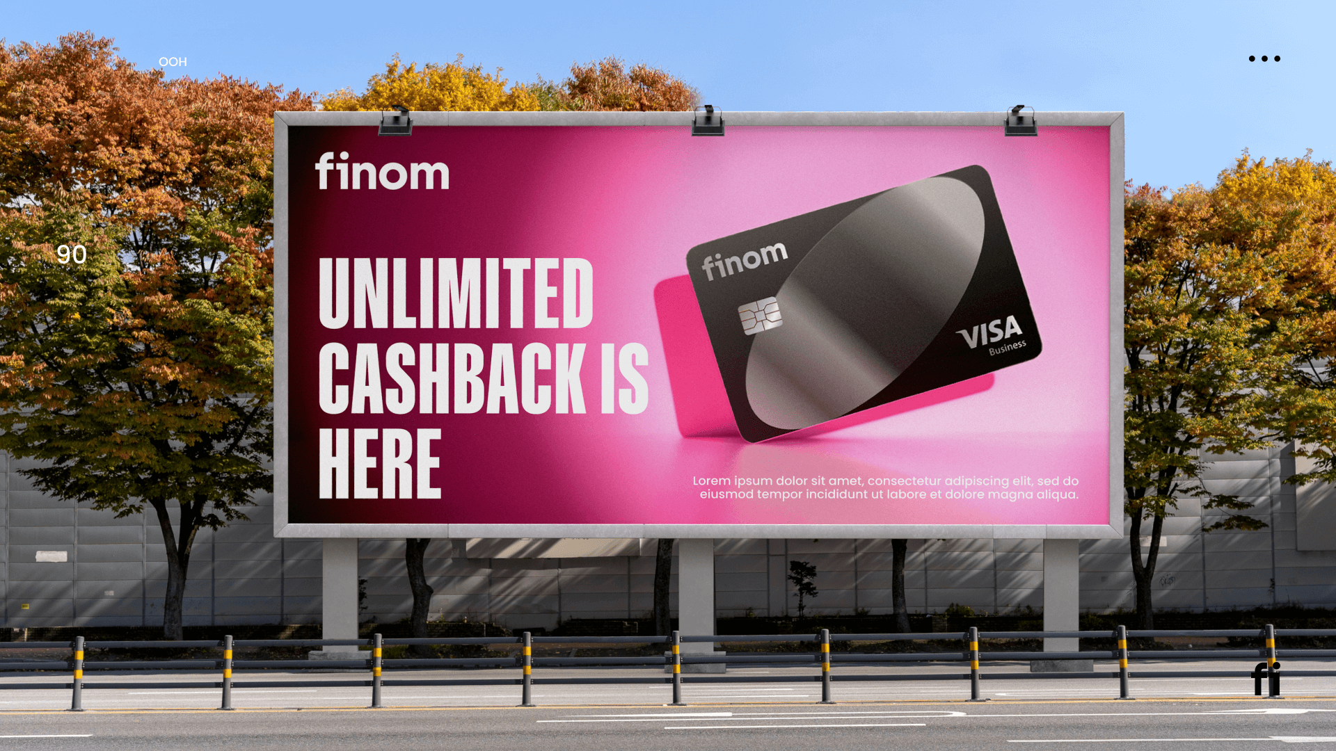
In 2025, Finom updated its visual brand DNA - from the logo and typography to the palette and graphic language - while keeping the name. I treated this not as "repainting the UI", but as a rare chance to make the brand tangible in the product. From the first touchpoint in marketing to everyday workflows in the app.

Challenge
Finom's visual identity had become generic: safe, corporate, forgettable. The goal was to create a brand with more energy and character, one that stands out in a crowded European market without losing trust.
Several agencies were involved in developing the new brand direction. My job was to bridge the gap between brand vision and product reality: translating concepts, giving structured feedback, and then leading the translation of the new identity into the product itself.
A rebrand is not a new logo, it's making the brand tangible at every touchpoint.
From the first touchpoint in marketing to everyday workflows in the product.
Key complexities
- Many surfaces. App, web, cards, marketing, emails, banners, different screens.
- Migration is a live product. Changes needed to ship incrementally without breaking existing workflows.
- "New character" vs clarity. More energy and personality, while maintaining readability, accessibility, and trust.
My role (end-to-end)
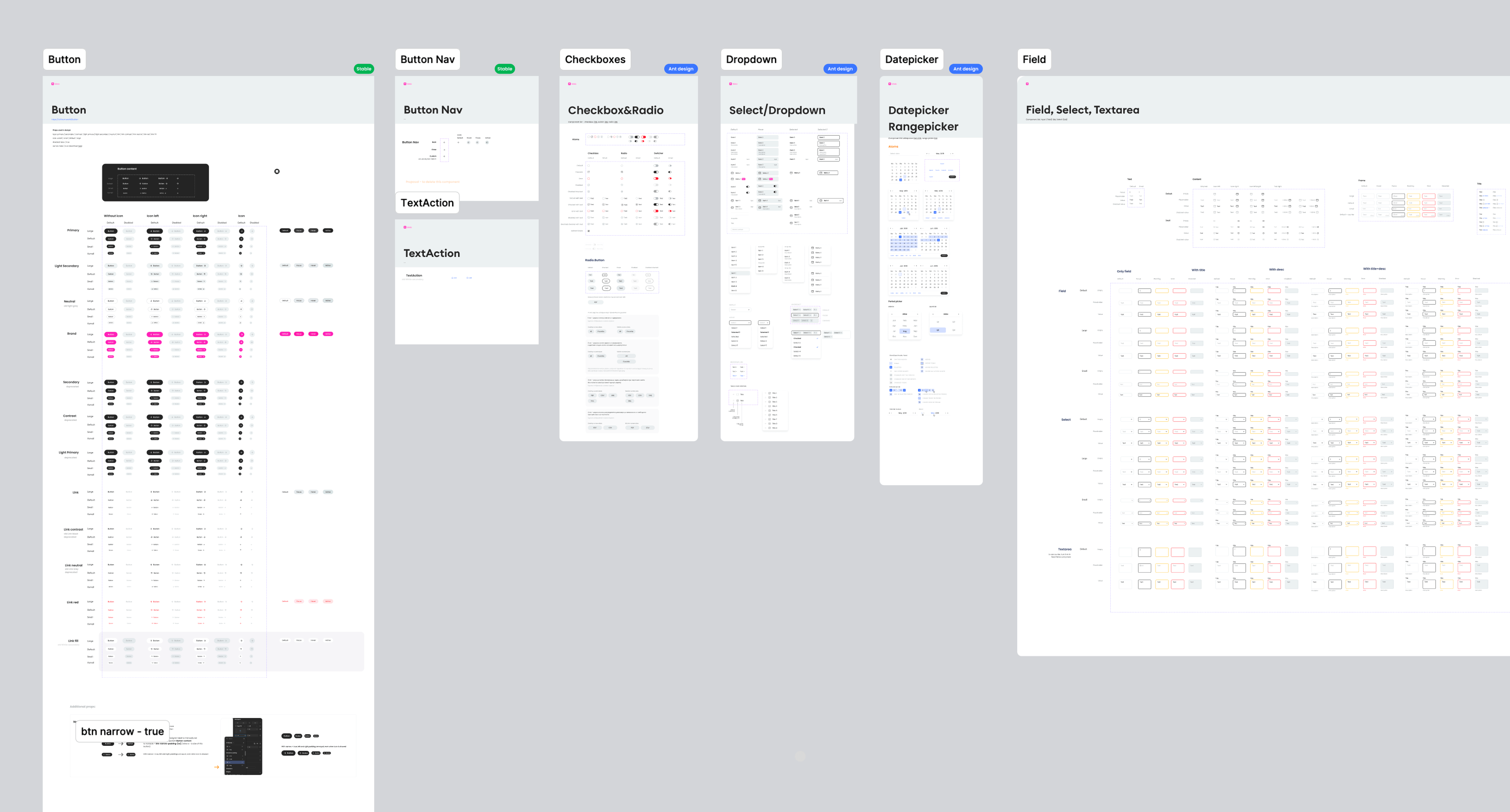
Controlled the brand vision at the product level: translated the agency's concepts, shaped components, and patterns.
Coordinated work to ensure consistency of typography, colour, and patterns across all domains.
Led the migration of all product surfaces to the new brand platform - ensuring consistency across teams and platforms throughout the transition.
What this gave the user
A distinctive visual language that stands out in the European fintech market without sacrificing trust.
The same brand experience from billboard to banking app - no disconnect between marketing promise and product reality.
Bold personality introduced without compromising readability, accessibility, or the confidence users need in a financial product.
Marketing, product, and communications aligned under a single visual system for the first time.
Outcome
The rebrand unified Finom's visual identity across every customer touchpoint - from product UI to marketing, packaging, and in-app communications - creating a consistent brand experience for the first time in the company's history.
-
Brand awareness 2x
doubled following the rebrand launch, measured through a survey of entrepreneurs across European markets before and after the new identity launched
-
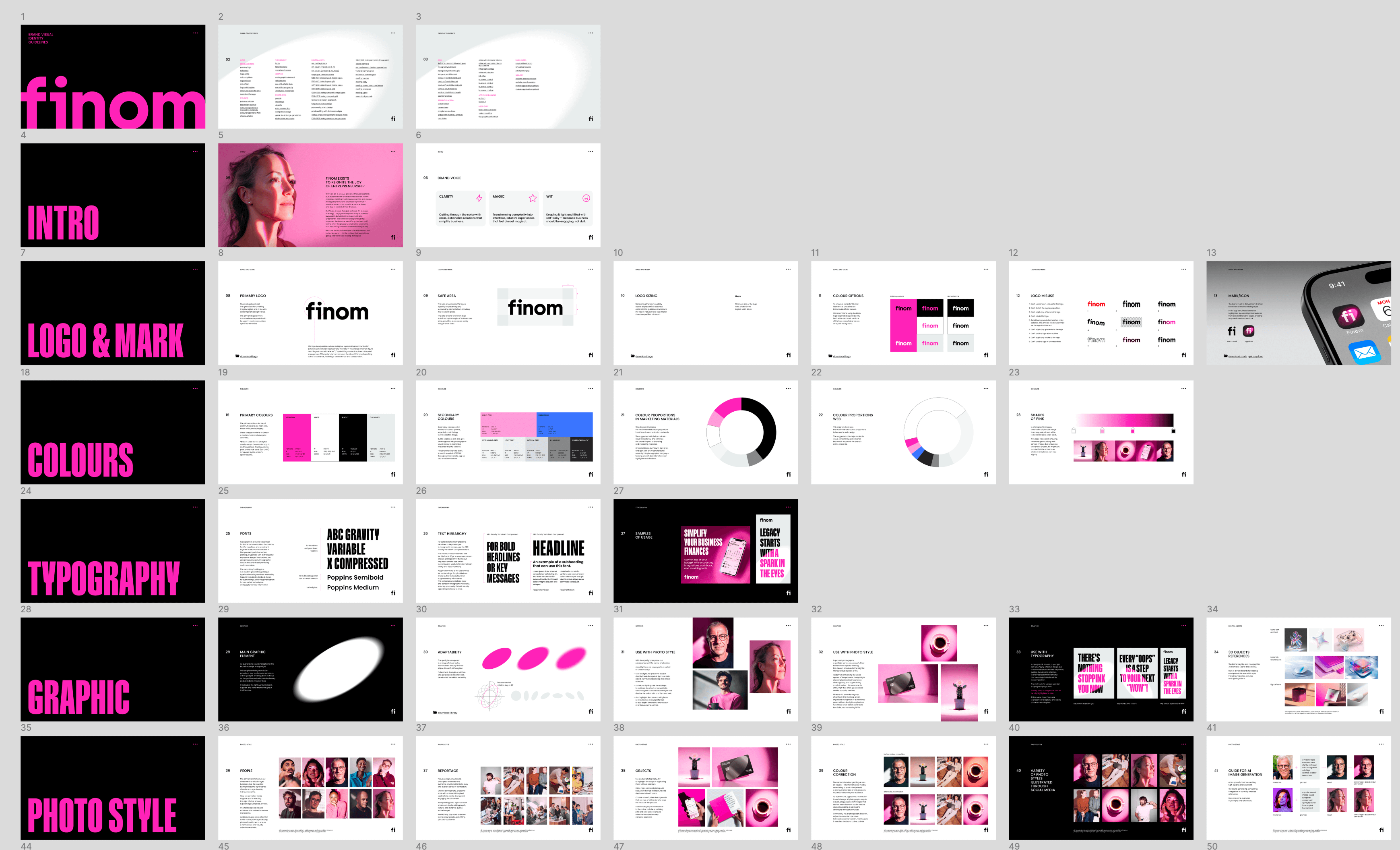
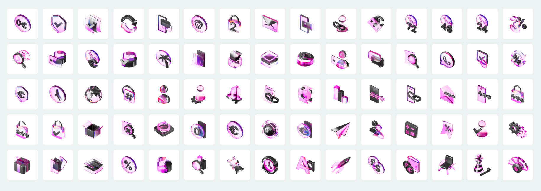
Visual system updated end-to-end
illustrations, icons, email templates, marketing materials, UI components, and communication assets redrawn under the new brand language across 5 European markets
-
Design system rebuilt 400+
components rebuilt around the new visual identity, with design-to-code synchronisation established across all product and engineering teams