Easy Anatomy 3D
Context
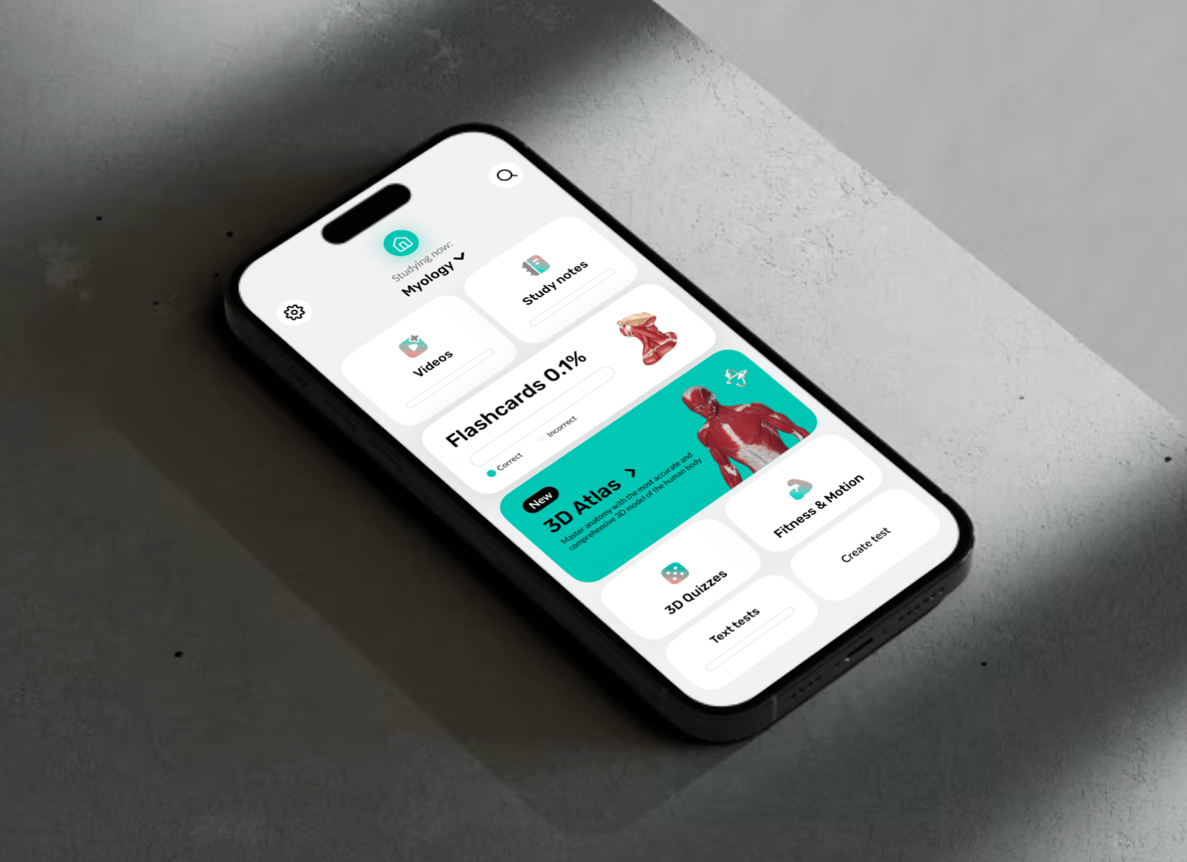
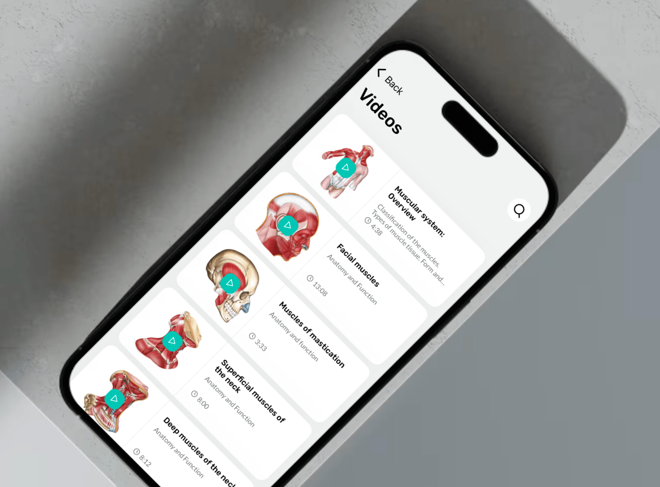
Easy Anatomy 3D is a consumer mobile app for learning human anatomy. It combines a 3D interactive atlas, AI assistant, quizzes, flashcards, study notes, and video content — targeting medical students, fitness trainers, and clinicians.
The business model is subscription-based. The core product goal was improving demo-to-paid conversion: users get access to most features in a limited demo mode, then encounter a paywall once they understand the product's value.
One app. Three mental models.
The complexity was structural, not just visual.
One 3D surface.
The challenge
Students, trainers, clinicians — each with different entry points, flows, and information needs.
Rotation, zoom, and tap-to-select can easily conflict on a small screen. No mobile precedent.
The paywall had to land after the user understood the product's value — not before.
What made the flow hard to simplify
The product had to connect content discovery, spatial interaction, and monetization without making the app feel fragmented. The solution was not one screen, but a sequence that explained value fast.
The team was lean: developers, illustrators, translators, a PR manager, and me as the only designer. I established a design system early to support fast iteration without breaking consistency.
Research
I benchmarked leading anatomy apps on the US market — focusing on navigation depth, 3D interaction models, and content discoverability.
Bring value closer to the surface. Reduce depth. Make key actions discoverable within the first two levels.
Standardize navigation logic. Reduce mode confusion. Make "where am I?" obvious throughout the app.
Key product decisions
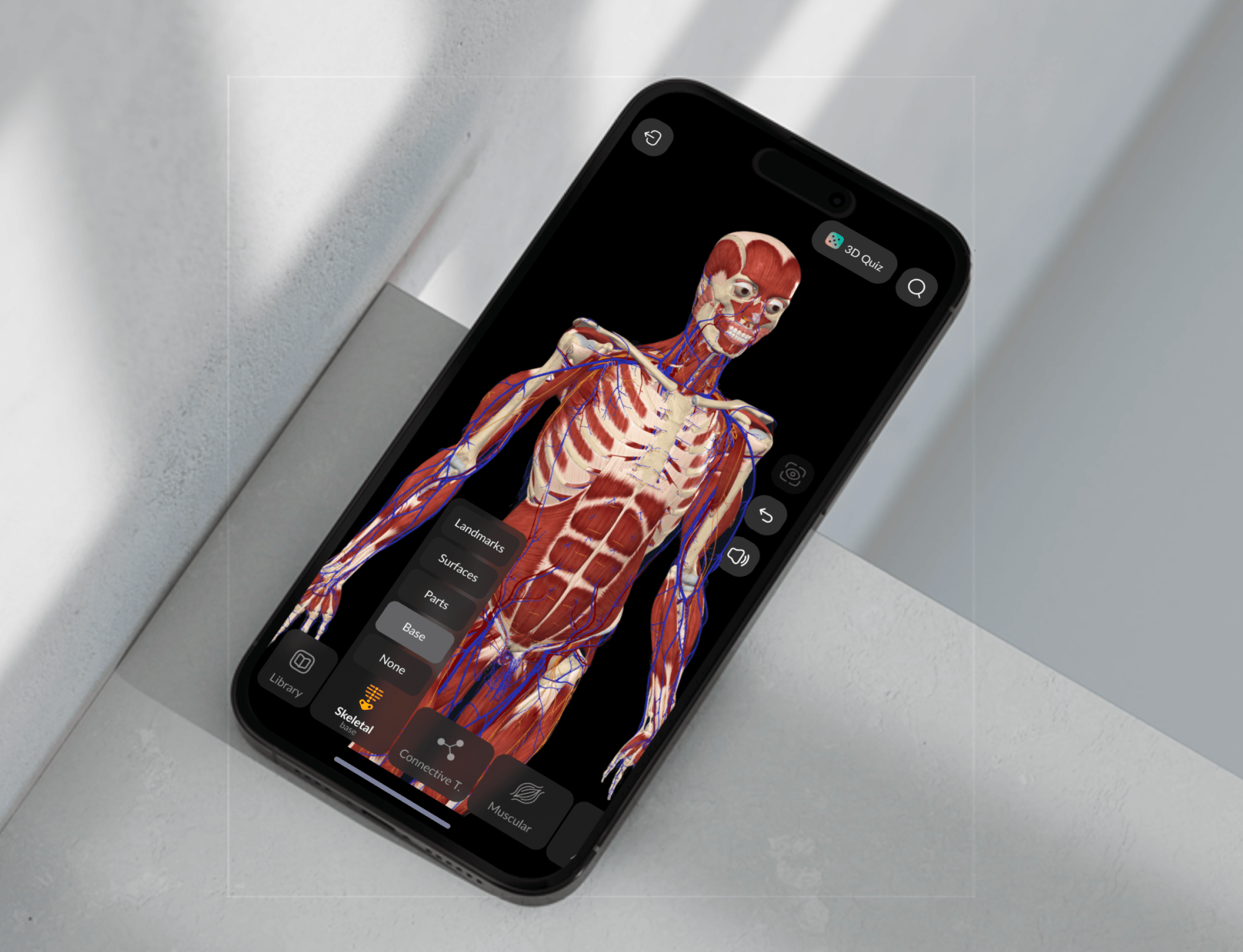
I treated the 3D Atlas as a primary surface with its own navigation model, optimized for spatial interaction. Cross-links to notes, quizzes, and learning flows kept the app feeling like one connected experience.
Users try learning scenarios end-to-end, explore features at surface level, and reach the paywall only after they have enough context to evaluate. The paywall becomes a logical next step, not a blocker.
Repeated experiments on benefit sets, messaging, layout hierarchy, and plan emphasis. The goal: reduce hesitation while keeping the experience transparent and non-manipulative.
3D interaction layer
The highest-risk UX surface in the app
- Ergonomics: rotation, zoom, and selection without gesture conflicts across thumb zones
- Selection states: structure highlight, label, and next-action options without cluttering the 3D surface
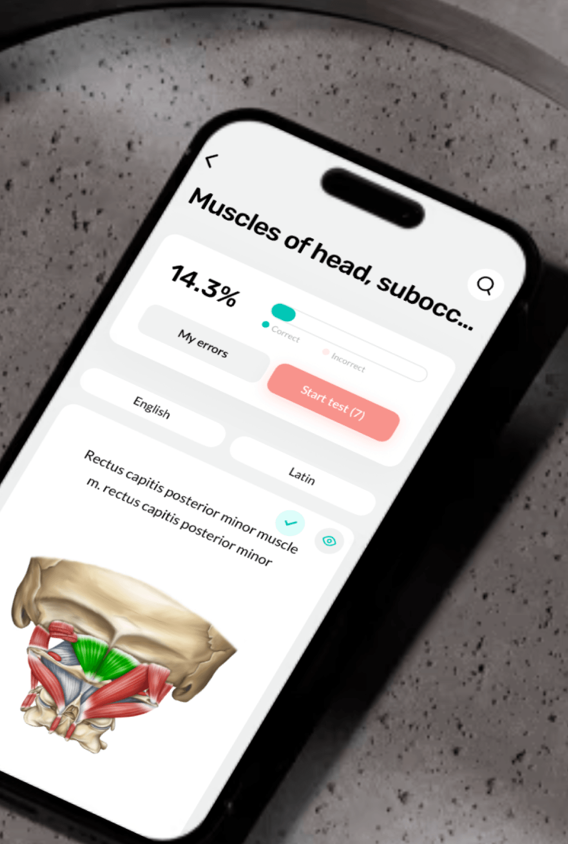
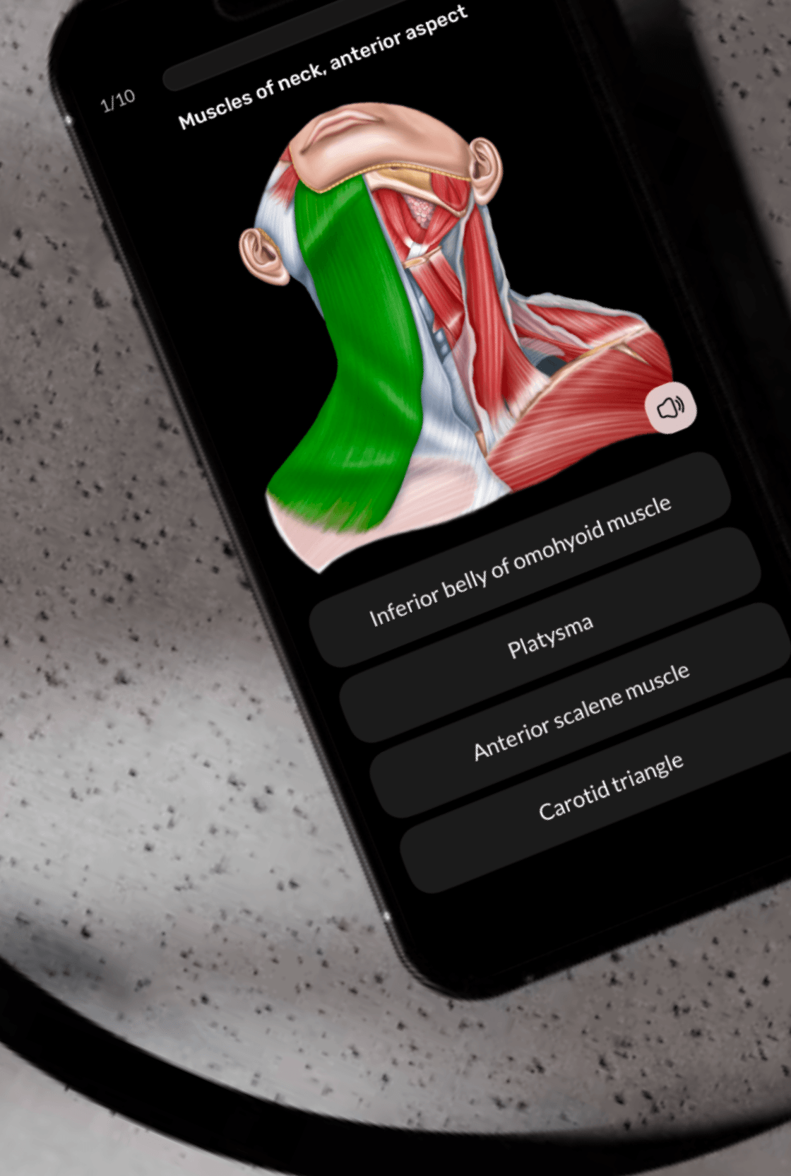
- 3D Quiz mode: the app prompts "find this structure" — the user must locate and tap it on the rotating model. A complete interaction loop: prompt → exploration → selection → feedback → next step
This wasn't a set of screens — it was a spatial UI pattern with no direct reference on mobile. I built the logic from scratch, drawing on patterns from spatial games.
The app shipped on iOS and Android. The navigation, 3D mode, and demo-to-paywall structure held up across all three audience segments.
The 3D Quiz became a flagship differentiator: no comparable anatomy app offers direct spatial testing on an interactive 3D model at this level of polish.