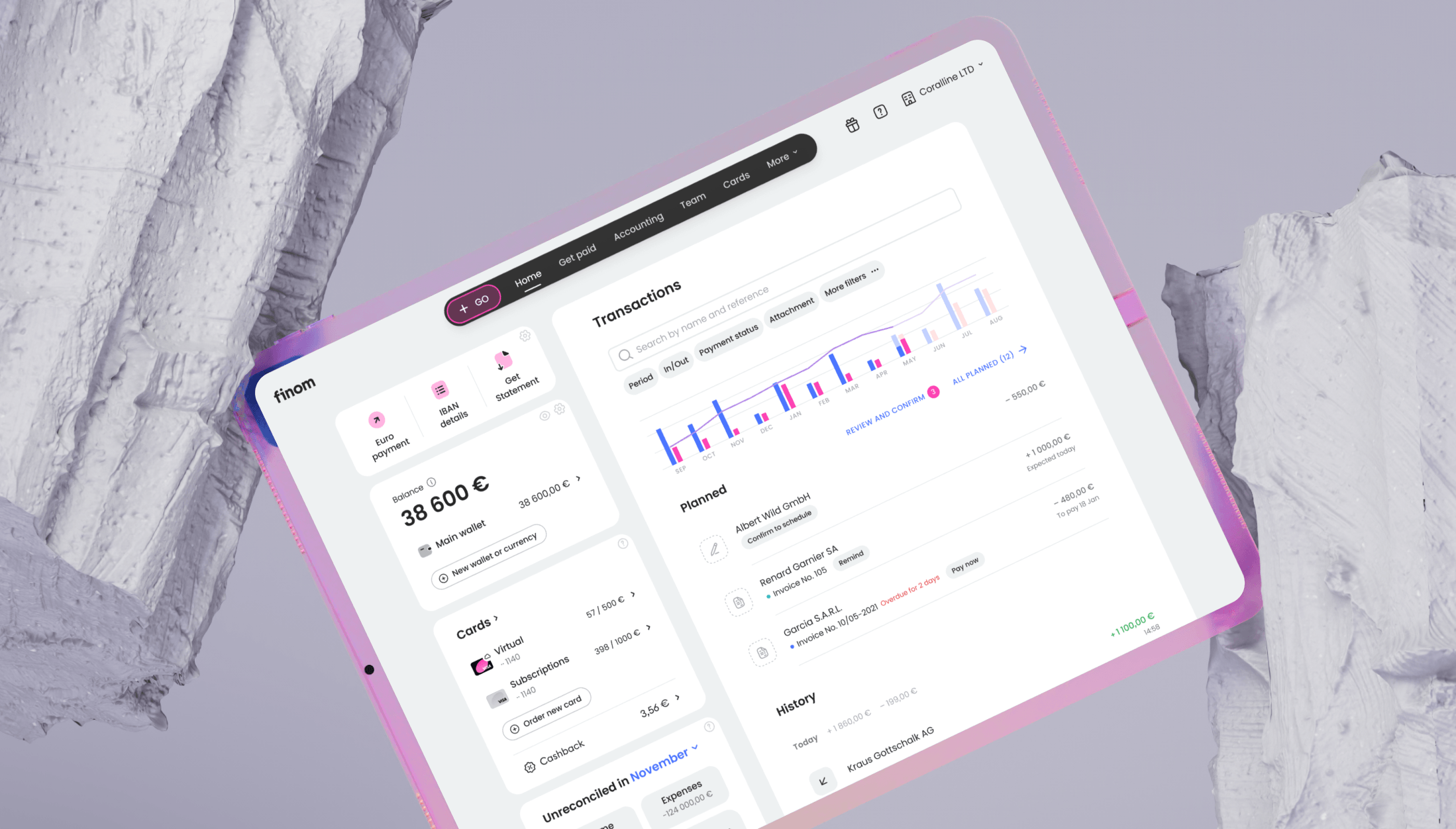
Dashboard & Navigation: Quick Access to Key Tasks
SMB customers do not think in terms of "banking" or "accounting". They think in tasks: send a payment, check an invoice status, upload a receipt. But as Finom grew into a multi-domain product, it became harder and harder to bring those tasks together in one place.
Invoices, payments, cards, accounting, and documents lived in separate sections, while user journeys cut across them. People got lost, switched between domains, and spent time navigating instead of getting work done.
SMBs think in tasks.
The gap between how users thought and how the product was structured.
The product was organized around domains.
My approach
Reviewed 30+ dashboard patterns across fintech and productivity tools to understand what navigation models work for multi-domain products.
Ran UX tests on early concepts to validate that task-based entry points work better than domain-based navigation for SMB users. Measured task completion time across variants.
A model that worked across different user roles, scaled with new domains, and didn't require users to learn a new mental model.
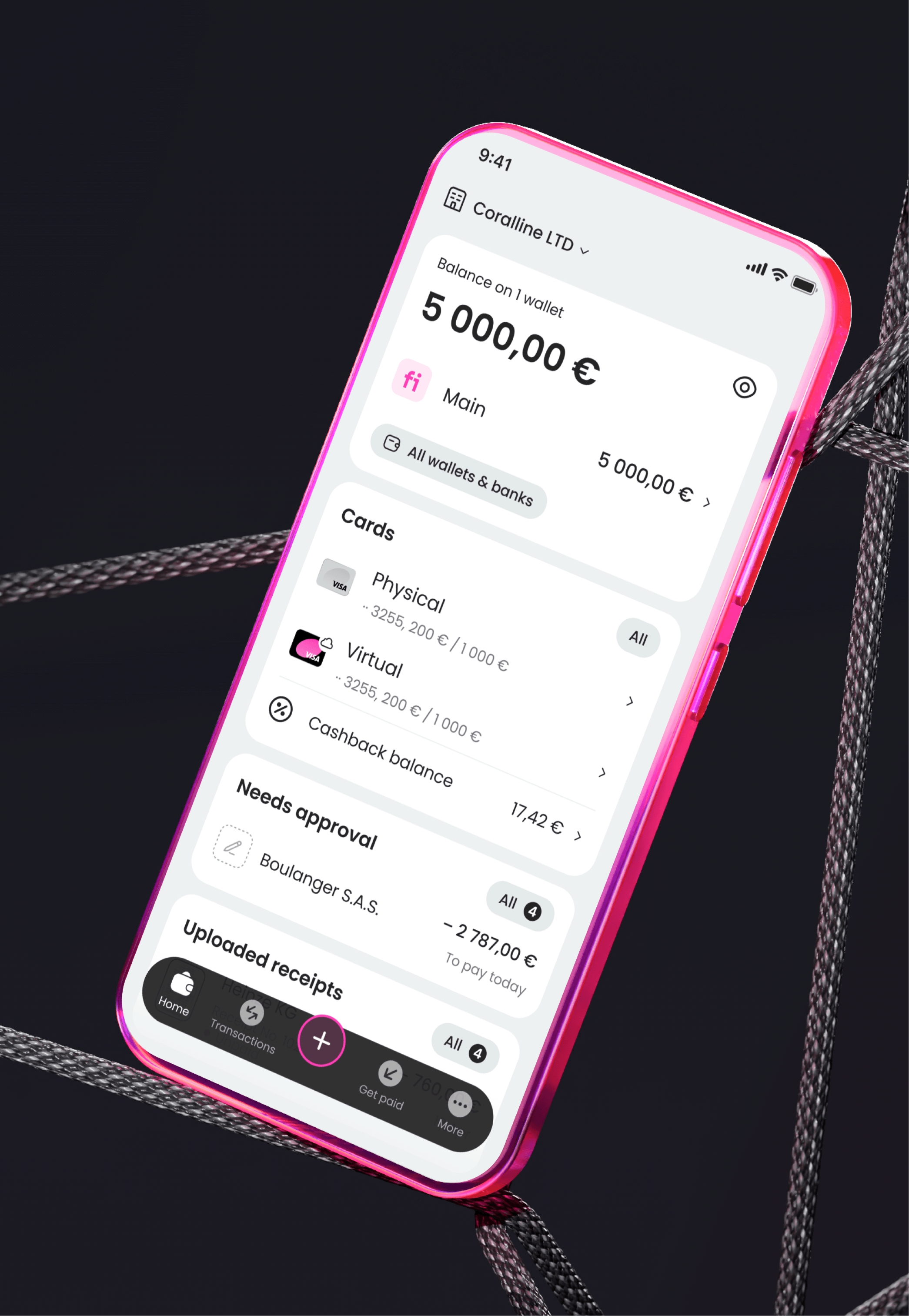
Video walkthroughThe new dashboard with task-based navigation, Go menu, and configurable widgets, showing how different user roles interact with the same entry point.
What this gave the user
What matters right now is visible — deadlines, unfinished actions, and exceptions.
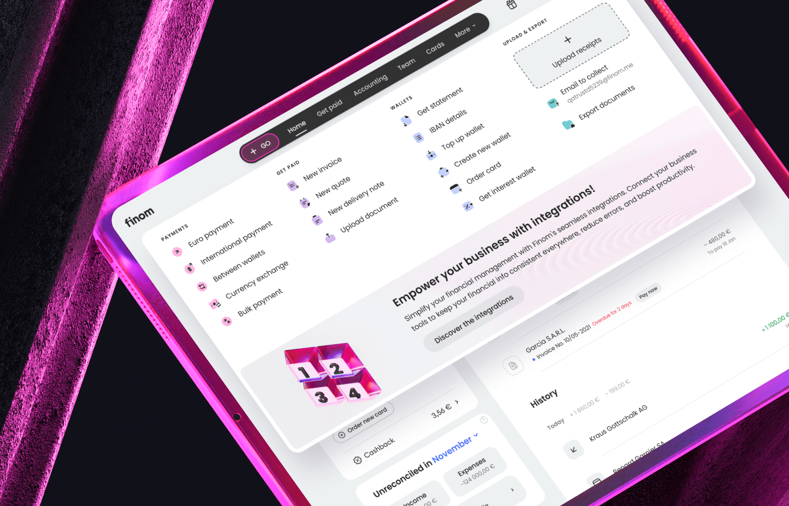
A Go menu and quick actions for common tasks: payment, invoice, document upload, card top-up.
Configurable widgets and block order based on role and habits.
Consistent entry points and navigation patterns across all domains.
Outcome
The redesigned dashboard became the primary entry point for all SMB users after launch. Usability testing confirmed that task-based navigation outperformed domain-based structure across all tested user roles.
-
Faster path to action -28%
task completion time for core flows like sending a payment or creating an invoice reduced by 28% in usability testing
-
Quick Actions widget 43%
of active users customised their Quick Actions shortcuts within the first 4 weeks after launch
-
Go menu drove feature discovery
tools like accounting shortcuts and document upload saw first-time usage from users who had not previously reached them through main navigation
-
Cross-domain confusion decreased
navigation-related errors and back-tracking in payment and invoicing flows dropped after unified entry points were introduced